Browse by Solutions
Browse by Solutions
How to Track the Historical Weekly Opportunities Pipeline using the Snapshot feature in the Opportunities app?
Updated on February 11, 2024 11:10PM by Admin
Apptivo provides a robust solution for businesses to capture and analyze the complete sales cycle with key data attributes, facilitating the monitoring of opportunity changes and trends over time. With the interactive data visualizations offered through the snapshot feature, companies can gain valuable insights.
For instance, consider a scenario where a sales team conducts bi-weekly sales huddle calls to assess their performance. During these meetings, they review the closed deals compared to their set targets, analyzing both the forecast and actual numbers. The platform also aids in tracking the pipeline of opportunities for each week, allowing the sales team to make informed decisions and strategize effectively based on real-time data.
Steps to Capture Snapshot of Attribute:
- Log in and access the Opportunities App from your universal navigation menu.
- Navigate to the Settings option within the Opportunities App, then under Opportunities, select the Snapshot Option.
.png")
- Enable the snapshot toggle.

- The table will be displayed to add attributes for capturing the snapshot.

- For instance, we've chosen to include the Close Date, Forecast Category, Sales Stage, and Amount attributes within the opportunity information section to generate the Target vs Actual Opportunities report.
- Data will be collected starting from the point of selection, with snapshots typically scheduled for automatic daily capture at 11:59 PM.

- The snapshot start date indicates the beginning date from which the snaps were taken. Click on the Save button to complete the configuration.
- You can also remove or replace attributes by using the remove button. Please note that this action will delete all existing Snap data associated with the selected attributes.

- Remember, you can add a maximum of 5 fields with attributes available, with exceptions for certain attributes such as Ref. app, Reference app attribute, Function, Counter, Email, Phone, and files.
- The data captured through the Snapshot feature is accessible for viewing and analysis in Reports.
Steps to configure the chart to analyze and compare Forecast vs. actual opportunities
- Navigate to the Opportunity application, then select Settings and proceed to Intelligence Charts within the Apptivo CRM platform.

- Click on the Create button to start configuring a new chart. Choose Grouped Stacked Column from the array of available options.

- Provide a distinct name for the Grouped Stacked Column. In this instance, it's titled Forecast vs Actual Opportunities Chart.
- Specify the access roles for employees by configuring the privileges, and then activate the chart by toggling the Enabled option.

- Utilize the right panel within the Inspector tab to configure the chart. Provide a descriptive title and a brief description of the chart.
- Title Name : Forecast Vs Actual MEA
- Description : MEA
- Adjust the chart's color by selecting Background. Tailor the chart's height as needed. If labeling is required, enable the Legend feature.

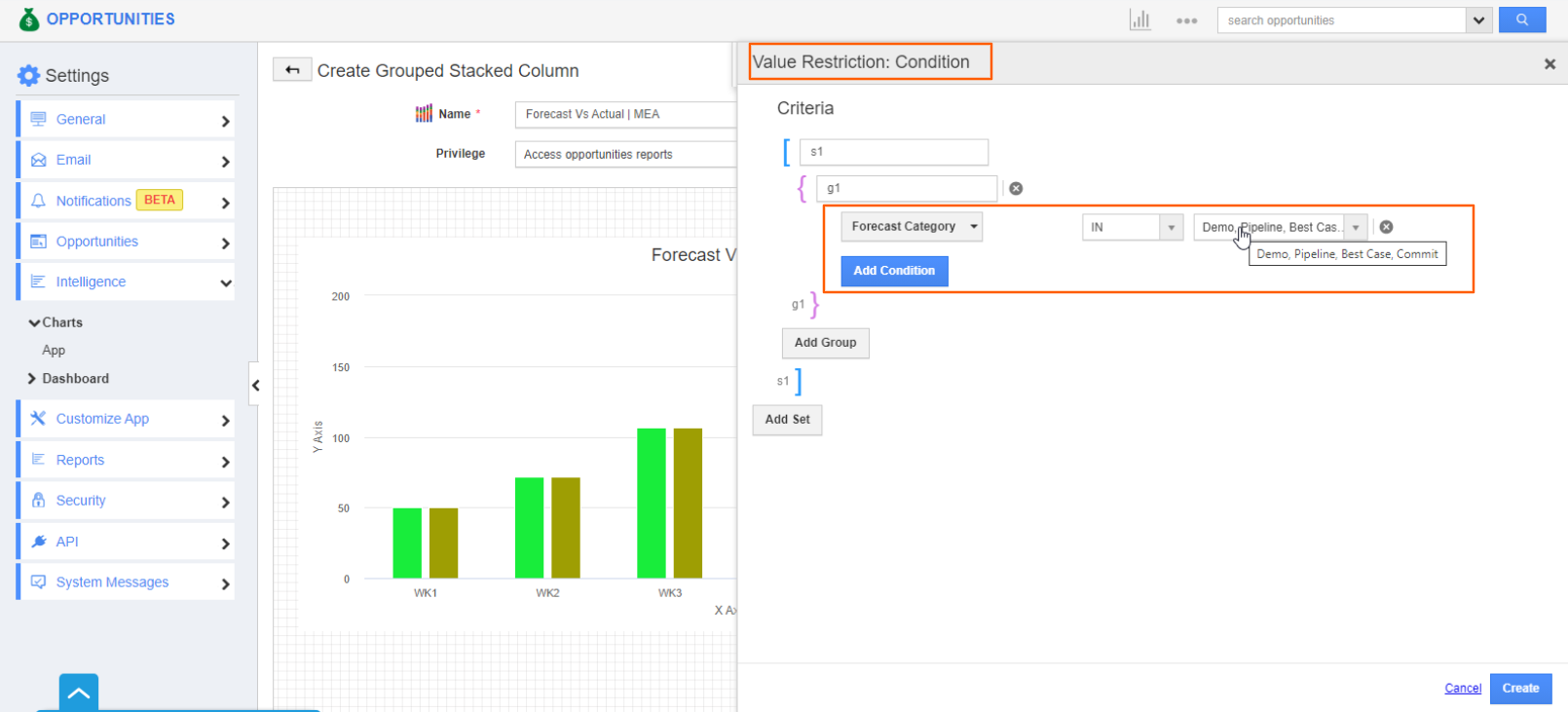
- To filter the opportunities used in this chart, navigate to the Inspector tab, select Filter → Value Restriction → Turn ON → click Condition.
- In this scenario, set the condition as Region = MEA This ensures that only opportunities located in the Middle East Asia are filtered and utilized in the chart.

- Finalize the process by clicking the Create button.
Configure Timeframe and Date Display on X-Axis
- Utilize the X-axis to visually represent the comparison duration on the chart, specifying the weeks and dates for clarity.
- You can customize the X-axis by accessing the X-axis tab located near the inspector tab. Here, you can assign a label for the X-axis and adjust the data type, which is set to weekly by default.
- Additionally, you have the flexibility to select a time frame of up to 13 weeks. This range effectively showcases approximately one-quarter of your sales data.

- Opt for a specific day of the week by selecting from the Use Snap Data dropdown option.
- For instance, select Monday from the previous week (X-Axis) and compare it to the corresponding day in the current week (Y-Axis)for a thorough analysis of sales data.

- You can select the attribute you want to compare by clicking on X date attribute and choosing the desired attribute.
- Please note that only the attributes added and configured in the snapshots will appear here.

- For example, if a user chooses Close Date and configures it to Use Snap Data of Current Monday for 4 weeks, the data for the 4 Weeks will be represented on the X-Axis.
- In this context, if the Snapshot is taken on January 1, 2024, the first Monday of the year, the following 3 weeks will also use the Monday snapshot for the chart.
Configure Target & Actual Data on the Y-axis
- To configure the Actual data, navigate to the Y-axis tab.
- Now, configure the Data Series by Selecting the Aggregation type as sum to aggregate the data for a comprehensive overview. Subsequently, click on the desired attribute for comparison; in this case, we have chosen Amount.
- Please be mindful that only attributes already configured in the snapshot section will be available for selection.

- Select the Attribute for comparing Forecast vs Actual on the Y axis, specifically opting for the Forecast Category.
- Customize the Y1 and Y2 axes according to your preferences, enabling the creation of a dual Y-axis chart that showcases two distinct datasets, one for Forecast and the other for Actual.

- Now, set up the configuration for the Y1 axis by assigning the Y1 label as Target. Customize the color for Y1 according to your preferences by clicking on the Y1 color option.
- By default, the X-Axis snap data will be used for Y1.

- Enable the filter by toggling it to 'ON' and define the condition as follows: Forecast Category IN Demo, Best case, Commit, Pipeline.
- Kindly note that “Forecast category” is a custom field. You can create custom fields pertinent to your sales process.
- This filter narrows down the search results to display only the opportunities associated with these forecast categories.
- Click the create button to apply the filter.
.png "Home-Add IP Address.png")
- Moving on to the Y2 axis, configure the Actual by assigning the Y2 label. Customize the Y2 color based on your preferences by clicking on the Y2 color option.
- Select the desired day for the snap data to appear, such as the current Friday.

- Enable the filter by toggling it to 'ON' and establish the condition as follows: Forecast Category IN Closed Won, Closed Loss.
- This condition is configured to filter opportunities with closed won and lost dates falling on the Current week Friday.

- Navigate to the Filter tab to apply additional filtering based on your specific needs. Turn on both the Enable Filter and Advanced Filter options.
- Click on Filter attributes and choose the attribute that aligns with your filtering requirements.
- Select the desired attribute to further refine and tailor the data presentation.

- After selecting the filter attributes, click the Create button.

- The chart is created successfully.
- Now, integrate the generated chart into the opportunities homepage on the dashboard. Navigate to the settings and access the Dashboard section.
- Select App and then proceed to click on Create.

- Within the Create app dashboard, input the necessary details such as the name, description, and privilege for the dashboard.
- Utilize the palette to drag and drop the One column layout.

- Next, drag and drop the previously generated chart. In this case, the Forecast Vs. Actual Opportunities chart should be placed within the designated box.
- Complete the process by clicking the Create button.

- The dashboard has been successfully created. To make modifications, click on the ... icon, or if needed, delete it using the delete icon.

- Go to the Opportunities app homepage and click on the created dashboard to view the details of the snap.

- The chart allows the user to compare the forecasted data at the beginning of the week (Monday) with the actual achievements marked as Closed Won by the end of the week (Friday), providing a comprehensive overview of the forecasted versus achieved data for effective analysis and decision-making.
- The results can be viewed in chart format, and clicking on any stack or bar will open the corresponding data table in a new tab.

- The table presents the configured attributes in the snapshot, with two columns for the snap attribute, displaying the current value and the snap value, along with a column indicating the week for which the data has been fetched.

- You can also export the data table in a CSV format for future reference.

- Here is a preview of the exported data table sheet.

- You can also download the data in CSV format by clicking on the three lines on the dashboard and selecting the option Download CSV.

- Here is an preview of the exported sheet.


Note:
- The Snapshot feature is exclusively accessible under the Enterprise plan.
- This feature is only available in web applications and not supported in the mobile application.
- Snapshots are retained for 6 months; however, if a field that was selected for a snapshot is deleted afterward, the stored snapshot data associated with that specific attribute will be permanently deleted and cannot be recovered.
- Trashed records are excluded from the Snapshot feature.
- Removing or replacing attributes within the master layout leads to the deletion of existing snap data linked to those attributes, even if they were previously configured within the App.
- Grouped stacked column will only be displayed if attributes are configured in the snapshot, otherwise the chart will not be displayed under the create button.
- If the master toggle is turned off, the system will delete the stored data. Activating the toggle restarts the process from scratch.
- The usage counts for the Stacked & grouped column chart will be displayed in both the charts feature and business settings, including any newly created charts.
- The grouped stacked column chart will only be displayed under the charts if attributes are configured in the snapshot. If no attributes are selected, the chart will not be displayed under the create button.