Real-time statistics are required for the smooth functioning of an organization. Organization prefers having the performance in charts to ensure quick understanding. Apptivo allows you to create an Intelligence Dashboard for Column Charts in the Work Orders App.
Step 1: Creating Charts
- Go to Settings → Intelligence → Charts → App in the Work Orders App to view the Charts Page.
- Here, you can either select create to create a new record or open an existing record. For Instance: Consider creating a new Column chart.
- You will be redirected to the Column Chart page.
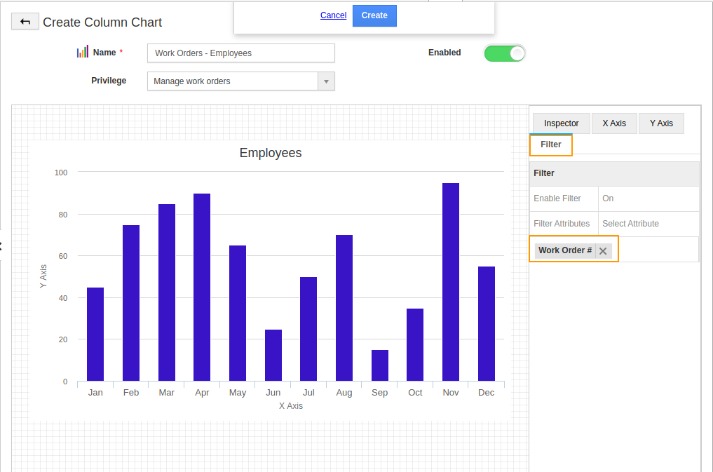
- Create a name for the chart and set the privileges. Based on the selected Privileges, only those employees who have the selected privilege can view the chart.
- To have the chart displayed in the dashboard, turn on the enable feature.
- Once, the basic configuration is complete, navigate to the Inspector tab.
Inspector Tab
- In the Inspector tab, you can perform multiple modifications to the chart.
Title: You can create a title for the chart.
Short Description: Adds a subtitle for the chart in this section.
Background color: This field allows you to customize the background color for the chart.
Height: Height section enables you to alter the height of the chart.
Legend: Disabling it removes the legend from the chart.
Value Restriction: You can set criteria for the values which are to be included in the chart.
- Here, the criteria feature is disabled.
Filter: You can enable filters to filter out the information in the chart. Here, the filter is set for the Work Order #.
X-Axis
- You can decide on the Data Type of X-axis to be either Weekly, Monthly, discrete values or numeric range. Here, it is set as Time (Monthly).
- The attribute chosen here is the Created date.
- On saving it, a new chart will be created.
Y-Axis
- Once the attribute is set for X-Axis, you can set the attribute for Y-Axis.
In the Y-Axis, you can set the aggregation type as Count or Sum. You can also add a label for it from the label section.
- You can also set the Y1 value. Here, the attribute is chosen as Pricing and the name is added for the Y-Axis.
- To add more than one attribute in the Y-axis, click on the + icon.
- Click create. You can see a new chart is created.
Step 2: Creating a Dashboard
Once the Column chart is created, it is mandatory to create a dashboard for the chart to reflect in the Opportunities App.
- Go to Settings → Intelligence → Dashboards → App in the Work Orders App to view the Dashboard Page. Select create to create a new dashboard.
- In the Create App Dashboard page, you can add the name, description of the dashboard while deciding the privilege.
- Once, the privilege is set, drag and drop a section from the palette tab followed by the desired chart.
- On clicking create, a new dashboard will be created.
- Now, navigate to the dashboards section in the Work Orders App. You can see the created dashboard Work Order-Employees listed.
- To filter out the records, you can click on the filter icon.
Related Article:


