Apptivo Intelligence Dashboards for Contacts app gives you the ability to visualize and analyze your data using custom dashboards. You can create and customize dashboards to get a simpler overview of the real-time information about your current business process in the form of charts and tables.
To add the Intelligence Dashboard please follow these steps.
- Create a Chart
- Create a New Dashboard
Steps to Create Charts
- Login and access the Contacts App from the universal menu.
- Click on the More(...) icon and select Settings.
- On the Settings page, click on the Intelligence → Charts → App.
- Click on the Create button and select the Column Chart.
- You will be redirected to the Create Column chart.
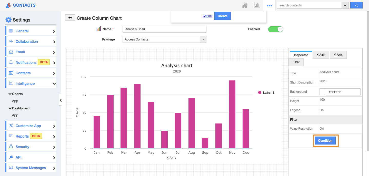
- Enter the Name for the Chart and set the Privileges.
Note: Based on the Selected Privileges of the Contacts, the employee will have access to the Charts.
- Enable the Toggle to display the chart in the Dashboard.
- Then, you can customize the Chart.
- Change the Title and the Sub Title of the Chart in the Title and Short Description section.
- Background color: You can customize the background color for the chart.
- Height: The height section enables you to alter the height of the chart.
- Legend: Disabling it removes the legend from the chart.
- Then, Enable the Value Restriction to set criteria for the values which are to be included in the chart.
- Click on the Condition.
- Here, set the Criteria on Value Restriction: Condition to include the records only if the contacts are created by the selected person.
- Once the criteria are set, click on the Create button.
- In the X-Axis, you can set the Data type as Monthly, Weekly, Discrete Values, and Numeric Ranges. You can also add a label for it from the label section.
- You can also set the X Data Attribute value. Here, the attribute is chosen as the Data Type is Time(Monthly) and the Attribute is Created On.
- Once the attribute is set for X-Axis, you can set the attribute for Y-Axis.
- You can set the Aggregation Type of the Y-axis to be either Sum or Count. Here, it is set as a Count.
- In the attribute chosen as the First Name.
- Then, click on the Filter Tab, enable the Filter.
- Here, the Contact Type and Follow up Date attribute are selected for the Filter option.
- Then, Click on the Create button.
- You can view the Created chart on the List.
Step 2: Create a Dashboard
Once the Column chart is created, it is mandatory to create a dashboard for the chart to reflect in the Contacts App.
- On the Settings page, click on the Intelligence → Dashboards → App.
- Click on the create button to create a new dashboard.
- You will be redirected to the Create App Dashboard page, add the name, description of the dashboard.
- Using the drag, and drop a section from the palette tab followed by the desired chart.
- Click on the Section Name, you will be navigated to the Inspector tab on the right side.
- Edit the name of the section in the Inspector Tab.
- Then, click on the create.
- The new dashboard will be created and you can view the Created Dashboard in the list.
- Now, go to the dashboards section in the Contacts App.
- You can see the created dashboard - Analysis Dashboard 2020.
- To filter out the records, you can click on the filter icon and determine the status based on which the record is to be filtered.


