To Create an Intelligence Dashboard you have to perform two steps.
- Step 1: Create Charts
- Step 2: Create a Dashboard
Step 1: Create Charts
- Login and access the Cases App from the universal menu.
- Click on the More(...) icon and select the Settings.
- In the Settings page, click on the Intelligence → Charts → App.
- Click on the Create button and select the Column Chart.
- You will be redirected to the Create Column chart.
- Enter the Name for the Chart and set the Privileges.
Note: Based on the Selected Privileges of the Cases the employee will have access to the Charts.
- Enable the Toggle to display the chart in the Dashboard.
- Then, you can customize the Chart.
- Change the Title and the Sub Title of the Chart in the Title and Short Description section.
- Background color: You can customize the background color for the chart.
- Height: Height section enables you to alter the height of the chart.
- Legend: Disabling it removes the legend from the chart.
- Then, Enable the Value Restriction to set criteria for the values which are to be included in the chart.
- Click on the Condition.
- Here, set the Criteria on Value Restriction: Condition to include the records only if the Case Source Is Not Empty.
- Once the criteria are set, click on the Create button.
- In the X-Axis, you can set the Data type as Monthly, Weekly, Discrete Values, and Numeric Ranges. You can also add a label for it from the label section.
- You can also set the X Data Attribute value. Here, the attribute is chosen as Need by Date.
- Once the attribute is set for X-Axis, you can set the attribute for Y-Axis.
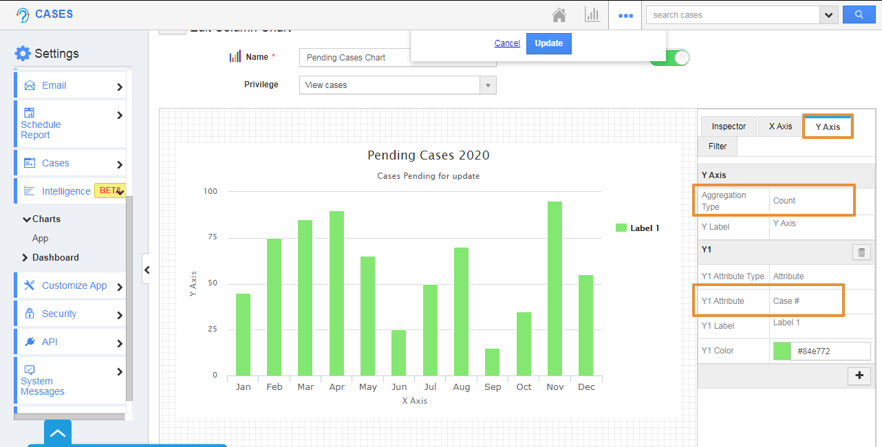
- You can set the Aggregation Type of Y-axis to be either Sum or Count. Here, it is set as a Count.
- In the attribute chosen as Case#.
- Then, click on the Filter Tab, enable the Filter.
- Here, the Case Status, Type, Priority, Assigned To attribute is selected for the Filter option.
- Click on the Create button.
- You can view the Created chart on the List.
Step 2: Create a Dashboard
Once the Column chart is created, it is mandatory to create a dashboard for the chart to reflect in the Cases App.
- In the Settings page, click on the Intelligence → Dashboards → App.
- Click on the create button to create a new dashboard.
- You will be redirected to the Create App Dashboard page, add the name, description of the dashboard.
- Using the drag, and drop a section from the palette tab followed by the desired chart.
- Then, click on the create.
- The new dashboard will be created and you can view the Created Dashboard in the List.
- Now, go to the dashboards section in the Cases App.
- You can see the created dashboard - Pending Cases Dashboard.
- To filter out the records, you can click on the filter icon and determine the status based on which the record is to be filtered.


