Browse by Solutions
Browse by Solutions
How do I Configure Intelligence Dashboards in Apptivo?
Updated on September 23, 2024 07:38AM by Admin
Once your business is set up in Apptivo, you will be most likely in need of interactive reports to monitor the various metrics. Besides the various standard dashboards and reports provided by default, you can also visualize and analyze your data using custom dashboards. The dashboard gives you deeper analytics of your most crucial information (business processes and performance) in the form of graphs and charts.
Apptivo Intelligence Dashboards enable you to present your business information, gaining a new perspective, and share it with employees and teams. You can create such dashboards using custom reports and charts. Here’s an example of what a custom dashboard looks like in Apptivo:
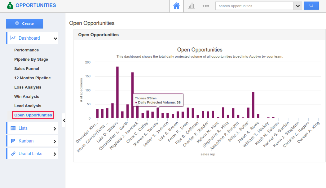
Intelligence dashboards in Apptivo are used to track business execution and reports/charts are displayed in the dashboard to give a crisp and simple overview of current business progress using tables and graphs. These dashboards are fully configurable and privilege-based, giving the required information in real-time.
The Intelligence Dashboards are available in the following apps - Opportunities, Contracts, Customers, Cases, Leads, Purchase Orders, Work Orders, and Projects App. Let’s now consider creating an intelligence dashboard in the Opportunities App.
Click on the following sections to learn more about the intelligence dashboards:
Creating Charts
The first step is to create a chart, using which a dashboard can be created. Charts visualize your business data in a way that makes the most extreme effect. The following types of charts can be created - Column Chart, Stacked Column, Bar Chart, Stacked Bar, and Summary Table.
Steps to Create Charts
- Log in and access the Opportunities App.
- Go to Settings > Intelligence > Charts > App > click Create drop down > Column Chart.
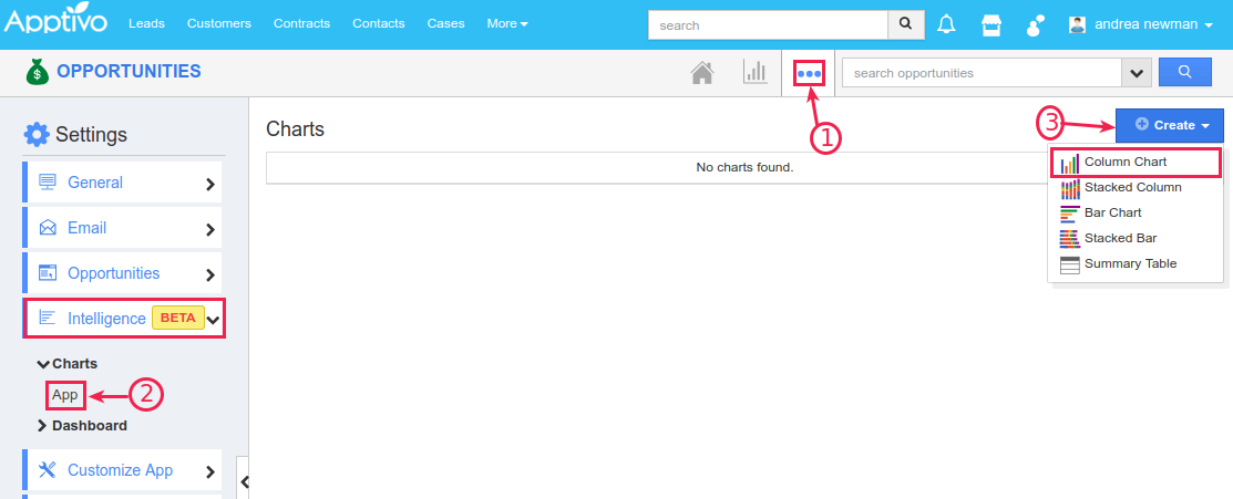
- In the Create Column Chart page, enter the following:
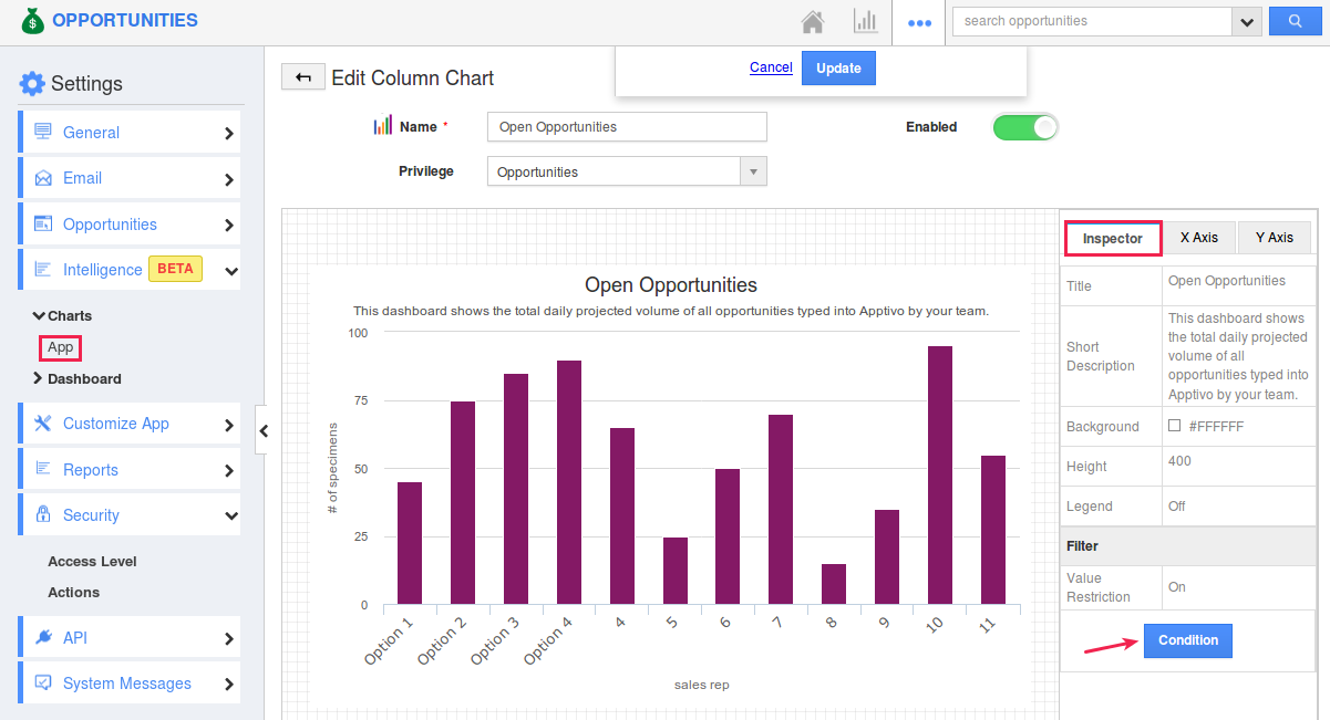
- Name - Enter the name of the column chart.
- Enabled - Sliding the toggle ON will make the chart available to create a dashboard.
- Privilege - This enables you to restrict access to the reports based on the privilege set. Based on the security privilege given, this report can be left open to all, or restricted to a specific user type.
- In the Inspector column, you can customize the Title, Short Description, Background, Height, and Legend. If you would like to have a view of specific opportunities matching certain criteria, enable the Value Restriction and click Condition.
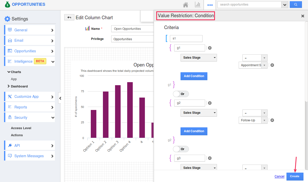
- The Value Restriction side panel will open, where you can mention the desired criteria and click Create.
- The next step is to customize the X-Axis and Y-Axis with the required business data.
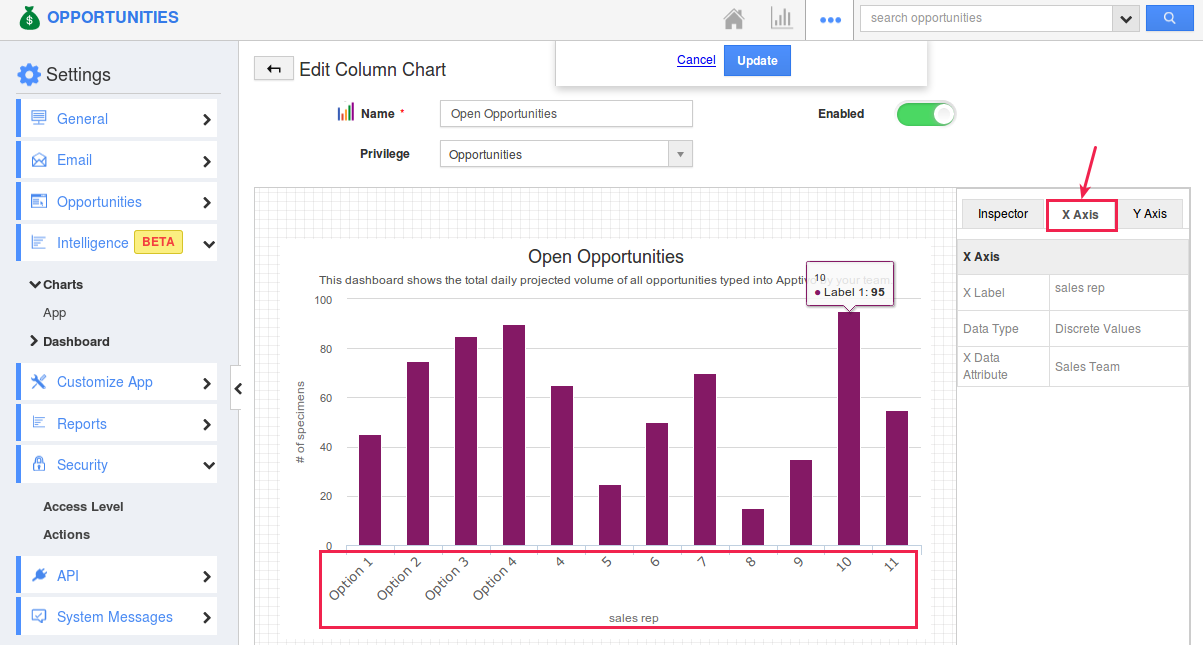
- In the X Axis tab, you can configure the following:
- X Label - The label name of the X-Axis.
- Data Type - This denotes the type range of the data. It can be set to Time (Monthly) (Jan to Dec), Discrete Values, Numeric Ranges.
- X Data Attribute - This denotes the opportunity attribute based on which the X-Axis will be populated. Select the required opportunity attribute from the drop-down.
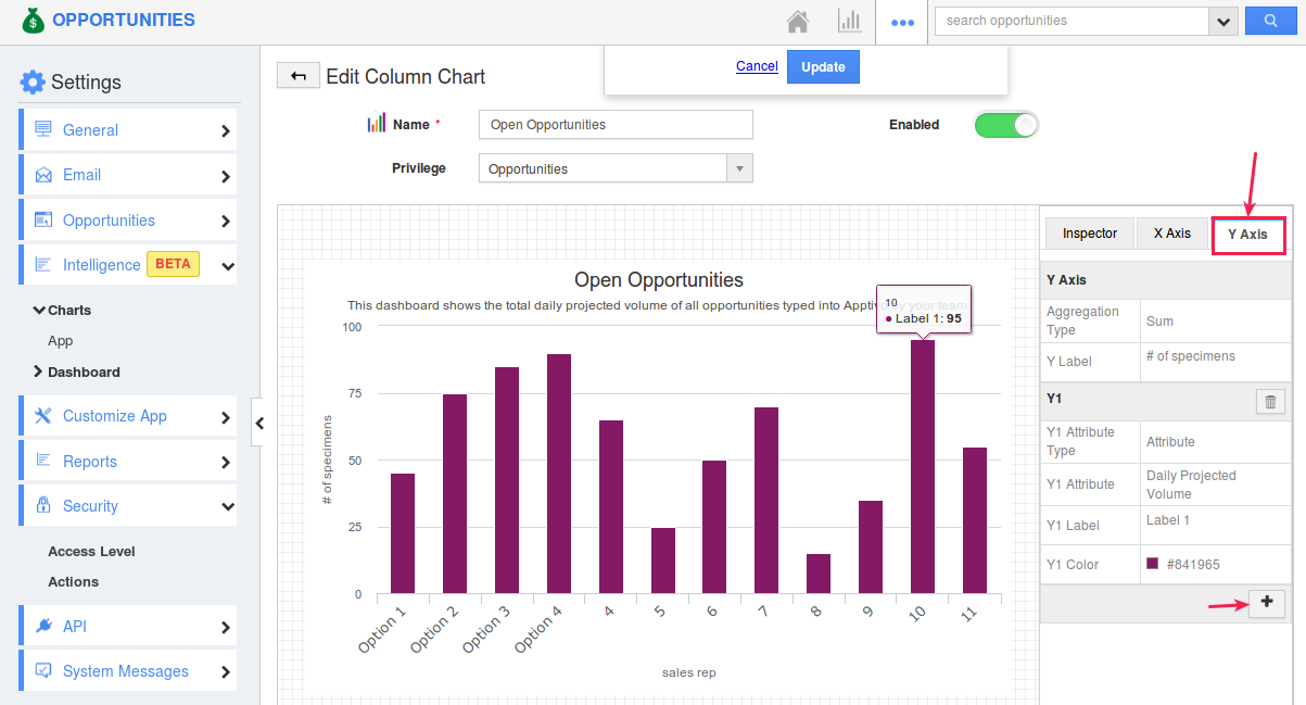
- Similarly, in the Y-Axis tab, you can configure the following:
- Y-Axis
- Aggregation Type
- Y Label - The label name of the Y-axis.
- Y1
- Y1 Attribute Type - Select the type as Attribute, which in turn displays the Y1 Attribute field below.
- Y1 Attribute - This denotes the opportunity attribute based on which the Y-axis will be populated. Select the required opportunity attribute from the drop-down.
- Y1 Label - Enter the Y1 Label name.
- Y1 Color - Select the color of the Y1 bar.
- By default, the Y-Axis consists of only one bar, that is, Y1. You can also have multiple bars, by clicking on the “+” icon found. (Here, we are going to have only the Y1)
- Save the created chart.
Creating a New Dashboard
Now that you have charts, the next step is to create a dashboard. The dashboard allows you to combine multiple reports/charts on a single page for a quick overview. In other words, the dashboard is an outlined perspective of the custom reports data. You can create a rich and intelligent dashboard by including the required charts/reports.
Steps to Create Dashboard
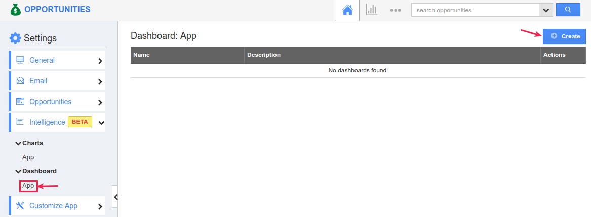
- Go to Settings > Intelligence > Dashboard > App > click Create.
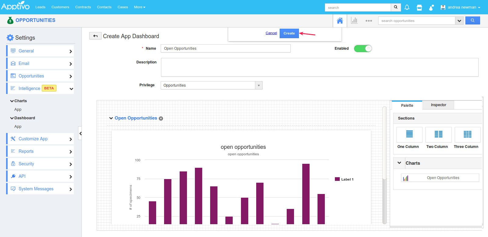
- In the Create App Dashboard page, enter the following:
- Name - Enter the name of the dashboard.
- Enabled - Sliding the toggle ON will make the dashboard visible.
- Description - Enter the description of the dashboard.
- Privilege - This enables you to restrict access to the dashboard based on the privilege set. Based on the security privilege given, this dashboard can be left open to all, or restricted to a specific user type.
- In the Palette section, you can view the above-created charts/reports under the Charts drop down. You can arrange them in a single, two or three column layout.
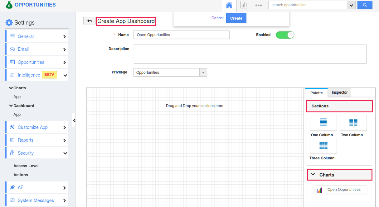
- Drag and drop the required section layout first. Next, drag and drop the above-created chart.
- Once done, the dashboard will look something like this. Click Create.
View Intelligence Dashboard
The above-created dashboard can be viewed from the homepage of the Opportunities App, as shown in the below image:


